Slides Checklist 1.0


Vrezh Oganisyan / March 14, 2021
5 min read • ––– views
A few years ago I was surrounded by people who were creating ugly and overwhelming slides with tons of text, without graphic content and even mems 🥺. At that time no one taught me how to create slides, so I was following others: dark colors, default fonts, text, text, and a little bit more text. At that time I started to feel that something is wrong!
After different lessons and talks, failures and successes, good and back feedback I managed to create a slides checklist that helps me to avoid popular mistakes.
Click on the button to go to the slides checklist or scroll down to read a little detail about the lessons I learned.
As I can see you decided to continue reading an article instead of jumping into the checklist. Reading texts is a rare skill in the 21st century so I'm happy that you had one.
Anyway, let's come back to the moment when after feedbacks and personal experience I understood that slides can influence on the lesson or talk someone is giving. I started to analyze how different approaches can influence the audience and understood that slides can both help or harm the process of information representation.
In a good way slides can help you:
- to keep audience attention and attract them even when the topic is boring (or let's say hard);
- to keep the lecturer focused and bring back to the topic (really helpful if you're as talkative as I am).
At the same time they can harm you by:
- distracting the audience's attention from the speech
- make the audience feel uncomfortable and overwhelmed
So let's discuss insights I came to:
1/5 The story of white space or why text matters.

Text can at the same time help people to understand what you're talking about or distract from the speech. Be sure to include a small amount of text which will emphasize what you're telling.
Some people make a mistake by including tons of text in the slide. It may make slides more informative but during the talk, people will start to read slides instead of listening. If you want to make the talk more informative, it'd be better to write a blog post regarding the topic you're covering.
Studies in design show that proper use of white space between lines of paragraphs and its left and right margins can increase comprehension up to 20%. So my recommendation is to add more white space into the slides by removing text. Don't afraid that your slides will look poor because your task as a speaker is to fill something else than space on the screen.
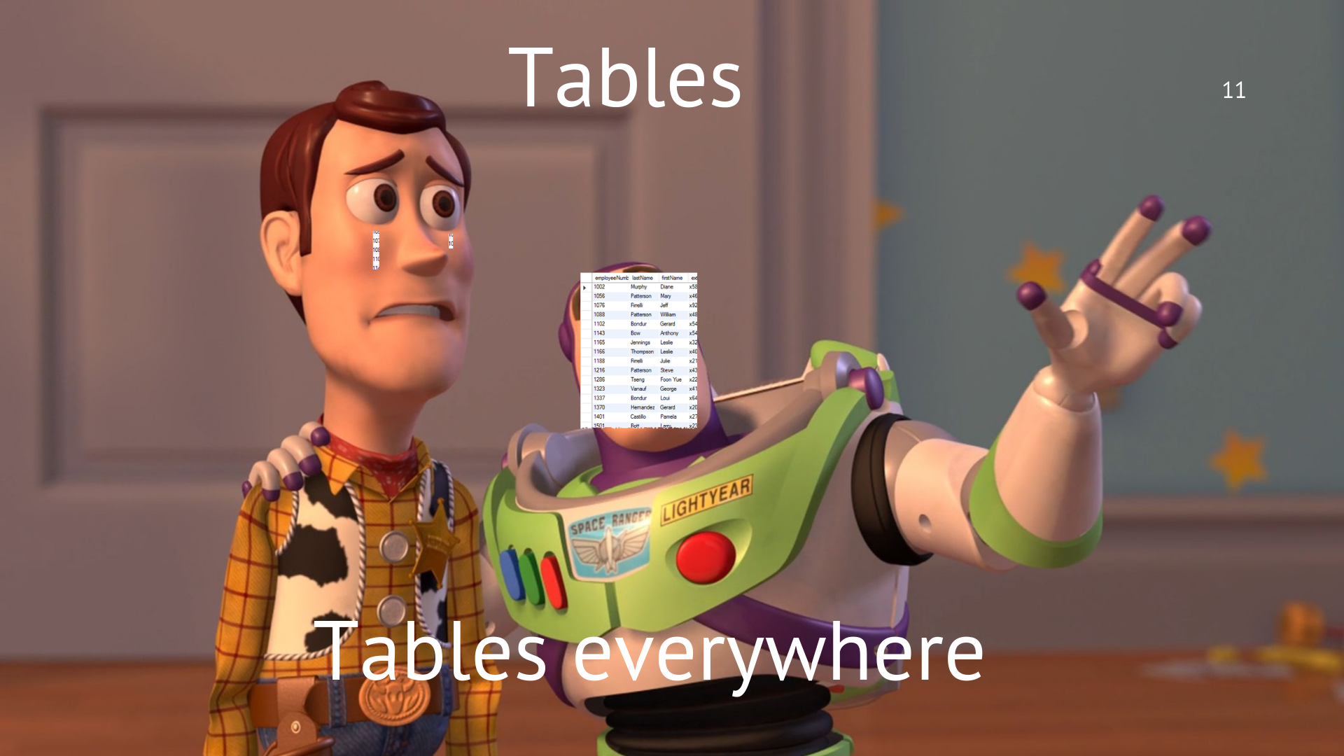
2/5 🙂 Graphic content and its influence 🙃

Please, add more visual content into your slides:
Images, Gifs, Videos
Emojis
and even Mems
They all help the audience to refresh attention and get back their interest if they lost at some point. Visual content also makes a hard and overwhelming topic look easier.
3/5 What about an interactive part?
Honestly, it's really hard for me to create a good interactive experience during the talks so I'm working on it hard (feel free to ping me if you've any advice).
Anyway, any time small Q&A sessions or quizzes are held, it helps the audience to feel the presence and make sure the material is mastered.
Think about it next time: how can you add an interactive experience for the slides?
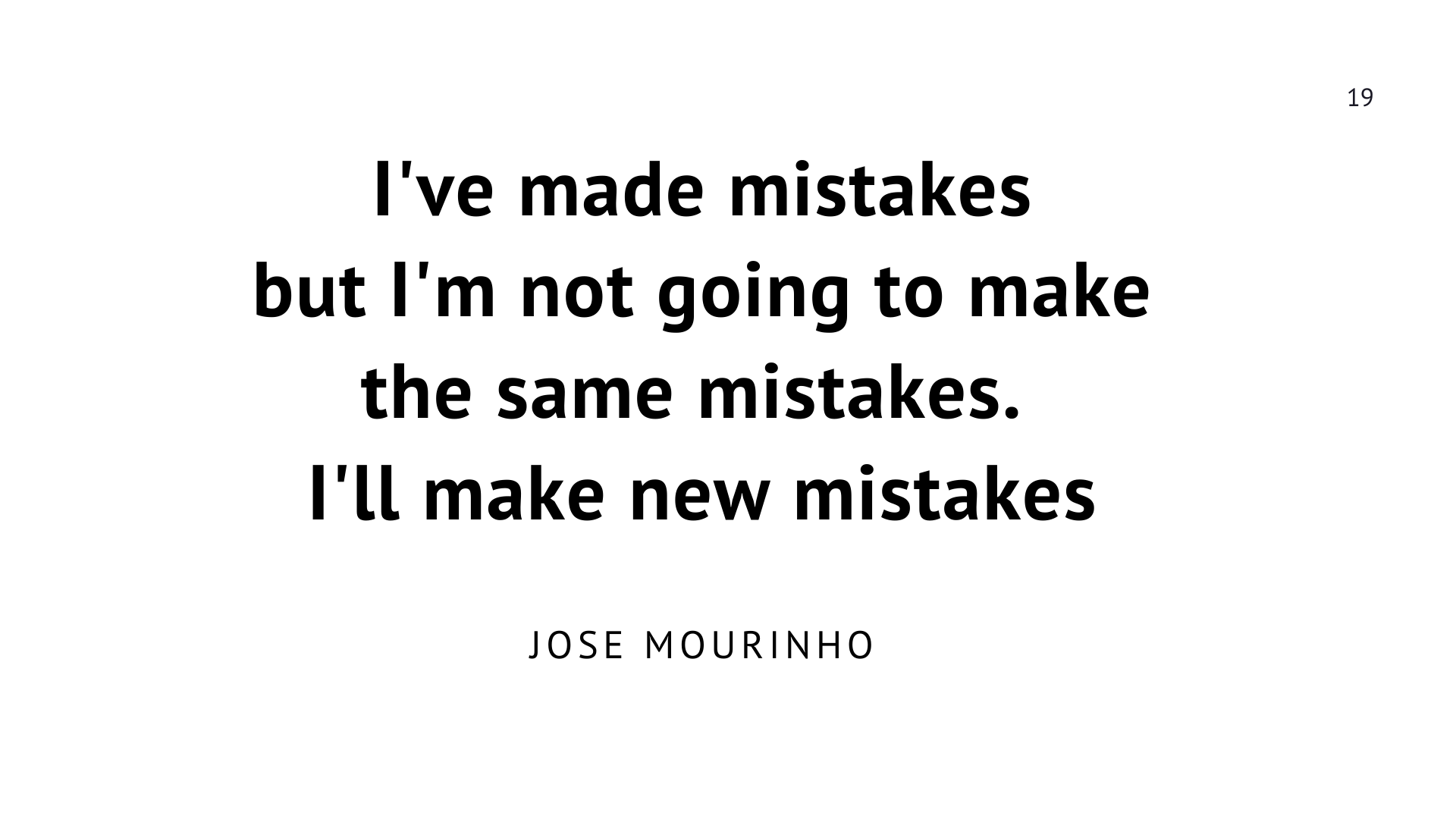
4/5 Maybe some fun?
Include some jokes or memes into the slides as visual or written content. Don't be afraid of looking not serious: release your inner standup artist and you won't regret it.
Everyone loves jokes so help the audience to feel closer and have some good laughs.
5/5 Checklist
Open notes and create a checklist of things you're going to include in slides next time or just use the one, I've already created. I've tried to create a structured list of things you need to do to make slides look better.
Don't forget Literature!
You might also like
The changing nature of future
In the article, I'd like to share some most important insights of the Deloitte's survey which explores the views of more than 27,500 millennials and Gen Zs and my opinion about them.
Published on June 28, 2020
The Rule of 20 Links 🔗
The rule that I've invented to motivate my students not giving up.
Published on May 23, 2020
The Flow Mode
About flow mode and the tools which may help you to keep this mode on!
Published on June 6, 2020